Comic Sans is a great font. Now that we are enemies, our relationship can only get better. But don’t hate me yet, don’t stop reading. I didn’t say it ironically. Comic Sans is an exceptionally good font when used in an exceptionally limited series of cases. Yes, letters speak to us beyond the words they compose. The font in which a text is written is something like non-verbal communication in a spoken discourse.
Comic Sans was designed in 1994 by denigrated typographic engineer Vincent Connare. But the truth is that Connare did a great job that was squandered by a series of bad decisions. At the time Connare worked for Microsoft Corporation. The company was developing Microsoft Bob, a package of applications designed to be especially easy to use, mainly by children, with a lot of children’s illustrations and a pet that was none other than Bob, a funny little dog that seemed to be created by a five-year-old boy (as a compliment). The whole Microsoft Bob package was accompanied by texts composed in Times New Roman, a font designed for a newspaper in the 1930’s. It was obvious: the texts did not speak the same language as Bob.
Connare designed Comic Sans to solve a problem. Bob needed a font to make himself understood. And it has been proven that his font is one of the most readable. Children who are unable to read texts in other fonts read smoothly in Comic Sans. In addition to being one of the best fonts to read in small bodies. It has other problems, of course, and an almost endless series of limitations. But when used at the right times, it’s almost perfect.
The story doesn’t have a happy ending. Microsoft Bob saw the light in Times New Roman, and Comic Sans was included as a complementary font in Windows 95. Suddenly, a font created for a specific use was within everyone’s reach for indiscriminate use.
The swimsuits of Olympic swimmers are wonderful garments. Delicate, precise, almost a miracle of technique. But if you go with one of those swimsuits to a wedding, you are a complete imbecile. No one would ever think that those who made those swimsuits made a horrible garment. Only an idiot misused one of them. Restaurant letters, ambulances, tombstones, porn pages or doctoral theses are some of the places where Comic Sans was used. Probably against its will. Remember: no is no.
Paint the words
That letters send a message regardless of what they write can be a curse or a blessing, but of course it is a tool that allows us to make the message more complex. It allows us, for example, to send double information, or ambiguous information, only with the choice of the “appearance” of our letters. This was not always the case. The origins of writing are based on pictograms, and later on hieroglyphics. Pictograms were symbols that practically reflected in a single stroke the element they referred to. Thus, the Sumerian pictogram for “ox” was an oval shape with two curved horn-like strokes.
And this is something that doesn’t have to be exclusive to the past. One of the most aesthetically elevated languages when written today is Japanese. It is based, for the most part, on adopted kanji from Chinese that functioned in a similar way to pictograms. The level of complexity of this writing makes almost residual the pictograms recognizable today, but we can still see how the kanji to refer to “tree” is a kind of branched trunk, or intuit in the kanji used for “woman” a certain anthropomorphic image.
But where the symbiosis between significant and meaning is most evident is in Egyptian hieroglyphics. Their way of writing down their history was literally by drawing it. And although a priori it may seem the opposite, their systems of representation were really expressive. The ancient Egyptians did not handle concepts such as “art” or “mimesis”, so their representations were not intended to be aesthetic, but descriptive. They were writing, let’s remember. Therefore, they did not know, nor did they need to know things like perspective. They represented the elements in their most representative position. If they wanted to represent a banquet, they placed the table seen from above, and the chairs around it, drawn in profile. It didn’t matter that it wasn’t coherent, but it was the best way to make us understand that those were chairs.
As a curiosity, this way of representing reality was one of the triggers of Cubism.

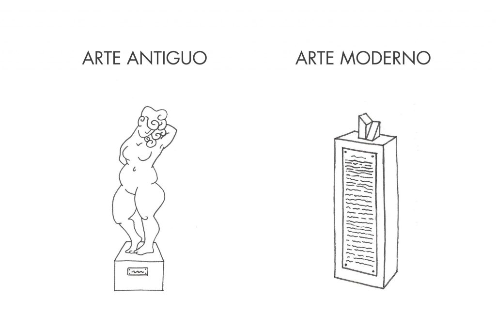
Writing art
Art historian and gallery owner Daniel Marzona wondered if it was possible for the discourse on art to be art at the same time. The writer Ian Wilson said that for him a poem could be a sculpture. Can a text be art? Yes, it is evident, there are hundreds of novels that are very great works of art but, can a text, not for its message but for its image, be… plastic, aesthetic? The plate of the man of Vitruvius of Leonardo has in its inferior and superior part a manuscript text in specular writing (from right to left). Regardless of what that text says, it is part of the drawing. Does it help in any way the harmonic composition of the plate? And if we understand art as a mode of expression, wouldn’t that text be a message beyond the message that words convey?
Moreover, it is not even necessary for a text to write something coherent to send a message. Just because, letters that don’t write anything also tell things. Many artists use text as an aesthetic element, as clay with which to model a work. Jaume Plensa takes this concept to the most scrupulous literality.
Plensa’s giant human figures are constructed of letters. Letters that write nothing. Letters as compositional elements that in turn form a figure, almost always human, seated, with legs bent and arms holding each other’s knees. Self-absorbed, lost in his own world, as if to say, “don’t bother me, can’t you see I’m reading?”
Also in the labyrinthine and almost architectural pieces of the sculptor Cristina Iglesias we can find superimposed letters in many of her “walls”. Joseph Kosuth, Jenny Holzer, Lawrence Weiner… are some of the contemporary artists who use text as a compositional, plastic, sculptural element.
And if we’re talking about turning the act of writing into a plastic art, we can’t overlook two disciplines: graffiti, which has been booming since the 1960s, and another that has been growing in recent years: lettering.
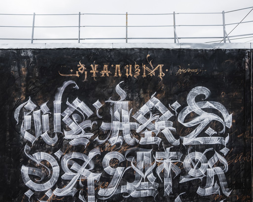
Lettering is a creative discipline that consists of drawing letters. And the correct verb is to draw, not to write. Therein lies the difference between lettering and calligraphy, the latter writing letters while the former understands them as forms, and not as symbols. It is true that it exists practically since the letters exist -the capitulars of the medieval tomes are very clear examples of lettering-, but the currents of the most current graphic design have brought a resurgence of this discipline, which is a real taste for our senses.
If you don’t believe me, and to give one more reference, take a look at the work of Pokras Lampas (www.pokraslampas.com), a 28 year old Russian who has taken lettering to another level. If you like it, know that you are not the first. People from Nike, Lamborghini, Absolut, Fendi or Hyundai liked it before you did. And don’t worry, he hasn’t written Comic Sans yet.